British Airways’ 1997 World Images Tailfins
The 1997 British Airways rebrand used Project Utopia to modernize the airline and replace its unified national tailfin with more than fifty culturally diverse World Images designs. The tailfin strategy failed. It provoked domestic opposition, created a valuable opening for Virgin Atlantic, and ended with the return of the Chatham Flag identity. The wider redesign produced a more complicated verdict because its Mylius typography, brighter aircraft treatment, and Speedmarque endured. British Airways had identified a genuine international growth constraint, but management treated inherited national symbolism as decoration it could remove without renegotiating its meaning with the public.
In June 1997, British Airways gathered the press at Heathrow to reveal the most ambitious identity project in its history. The airline had spent roughly £60 million changing how it presented itself to the world. Its aircraft were brighter. The typography felt warmer. A flowing ribbon had replaced the rigid red stripe along the fuselage.
The most visible change appeared on the tails.
British Airways removed the familiar national treatment and replaced it with dozens of artworks drawn from cultures around the world. The company had research supporting the strategy and a genuine international growth problem to solve. Several parts of the redesign would remain for decades. The tailfins lasted less than four years.
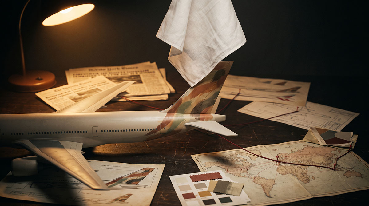
A few months after the launch, Margaret Thatcher was handed a model British Airways aircraft carrying one of the new designs. She removed a white handkerchief from her pocket, placed it over the patterned tail, and condemned the airline’s decision. That brief gesture became the image through which the entire rebrand would be remembered. It also made the case appear far simpler than it was.
The Covenant on the Tarmac
British Airways entered the Project Utopia era with an identity built during the airline’s privatization. The Landor design communicated institutional authority. Its dark lower fuselage, formal typography, heraldic crest, and stylized Union Flag presented British Airways as the official carrier of a serious nation. The identity made status visible.
Years of prominent advertising and international expansion had reinforced that position. British Airways called itself “the world’s favourite airline,” and its financial performance gave the claim weight. The company was profitable, globally recognized, and strongly associated with British competence. No public crisis demanded a radical change.
Inside the company, the pressure looked different. The Landor identity carried valuable meaning, but some of that meaning traveled badly. Authority in Britain could resemble hierarchy or imperial distance elsewhere. An identity that had helped British Airways become a national institution was becoming harder to manage as the airline expanded internationally.
The airline’s identity functioned as a covenant. Covenants don’t answer easily to consultants.
Management understood that it owned the aircraft, trademarks, colors, and design standards. It underestimated the separate claim many British people believed they held over what those symbols represented. That distinction would determine the outcome.
The Pressure Beneath the Triumphs
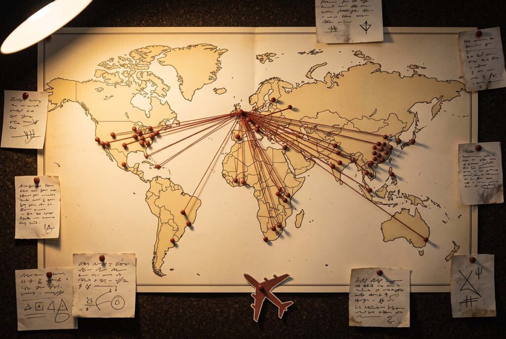
British Airways had legitimate reasons to reconsider its presentation. Around 60 percent of its passenger traffic originated outside the United Kingdom. The company was investing in regional airlines across Europe and Africa, and some overseas operators resisted displaying overt British national imagery on their aircraft. Internal research produced another warning. Parts of the international business audience saw the existing identity as formal, arrogant, and detached.
The diagnosis was credible.
A system created for an earlier period of British aviation was being asked to support a more internationally sensitive company. Executives recognized that the existing identity could constrain growth. British Airways commissioned Newell and Sorrell in 1995 to create a new corporate identity. The initiative received the internal name Project Utopia.
The brief called for modernization, and much of the work delivered it. Mylius replaced the previous typography with something warmer and more approachable. The aircraft fuselage became brighter. A flowing three-dimensional ribbon called the Speedmarque replaced the sharp red line running along the body. Those elements survived the controversy and became part of British Airways’ long-term identity.
The design changes would last for decades. The tailfins wouldn’t.
British Airways made a separate strategic choice for the tails. Instead of developing one modern British identity for a global market, it commissioned more than fifty designs inspired by artwork from around the world. The fleet became a moving gallery. The concept addressed the company’s international problem directly. Overseas customers and regional subsidiaries would no longer encounter an airline presenting itself through one dominant national symbol. British Airways would appear cosmopolitan and culturally inclusive. Some international audiences received the gesture exactly as intended.
The same decision carried a different message at home.
Fifty Flags, One Handkerchief
British Airways believed it was expanding the meaning of its brand. Many people in Britain believed the airline was abandoning it. The tabloid press supplied the controversy with a durable label: “ethnic tailfins.” Two words reduced a large, carefully researched identity system to the accusation that management had exchanged national identity for fashionable multiculturalism.
The timing made the project especially vulnerable. British Airways was locked in a bitter dispute with cabin crew while the new aircraft appeared. Employees who might have introduced the identity to the public were instead criticizing its cost and dismissing it as corporate vanity. The external message promised global unity while the internal reality showed industrial conflict. The company’s culture and public identity were contradicting each other before the same audience.
Virgin Atlantic saw the opening. Richard Branson’s airline began displaying Union Flags prominently on its aircraft and positioned itself as “Britain’s flag carrier.” The move worked because British Airways had made the patriotic territory available. British Airways vacated a position it had occupied for decades. Virgin walked into the empty room and redecorated.
The controversy now carried a competitive cost. A rival was converting public anger into a clear positioning advantage.
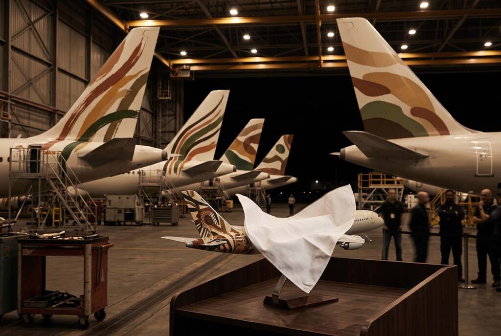
Margaret Thatcher then supplied the defining image. At the Conservative Party Conference in October 1997, the former prime minister was shown a model Boeing 747 with a Botswana-inspired tail design. She removed a white handkerchief and placed it over the pattern. The gesture required no explanation. The artwork had become something to hide.
Thatcher didn’t create the resistance to Project Utopia. She compressed it into a photograph that newspapers could reproduce and the public could remember after the details of the design brief had disappeared. The handkerchief didn’t cause the collapse. It named it.
A disagreement about design became a dispute over institutional authority. Who held the right to redefine what a national carrier meant? British Airways could cite passenger data, overseas subsidiaries, and market research. Its critics could point to the flag. One argument depended on analysis. The other depended on symbolism.
Symbolism traveled faster.
The Flag Returns
British Airways’ later financial decline requires careful treatment. Profits fell sharply, but the tailfin strategy didn’t cause every commercial problem that followed. Labor conflict, cost pressures, and economic disruption in Asian markets also damaged the company. A direct line from unpopular artwork to every financial setback would make a satisfying story. The evidence doesn’t support it.
The controversy reduced British Airways’ room to maneuver. A company facing operational pressure benefits from employee confidence and customer goodwill. It also needs control of its public narrative. British Airways was weakening across each area at once.
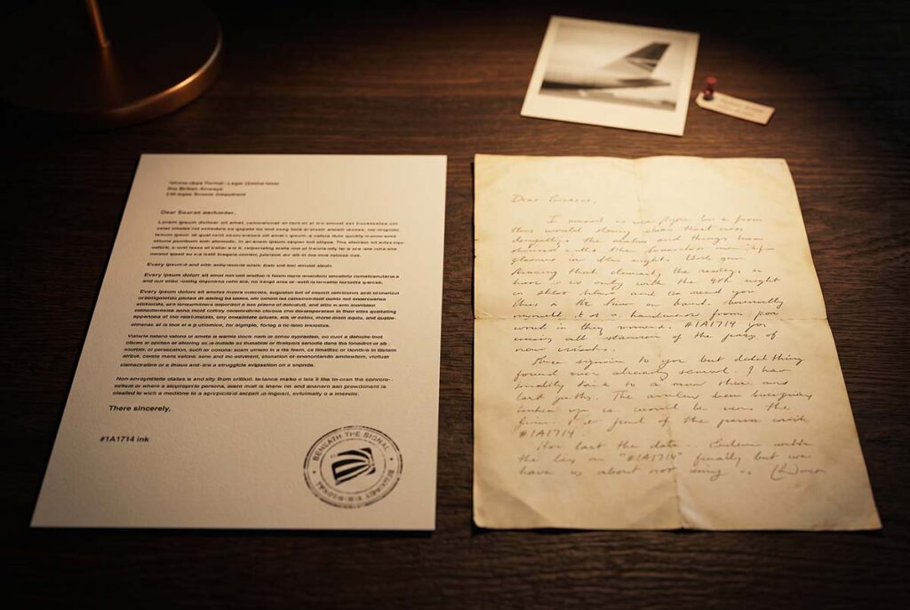
The airline halted the rollout of additional World Images designs in 1999 and acknowledged that the tailfins were performing poorly in customer research. Bob Ayling, the chief executive closely associated with Project Utopia and the airline’s wider restructuring, was removed in 2000. New leadership consolidated the fleet around the Chatham Flag design. The unified Union Flag treatment had originally been created for Concorde. It now became the solution for the wider airline. British Airways abandoned the World Images program by 2001.
The national symbol had returned. The unpopular artwork was disappearing, and the executive most closely associated with the strategy had gone. That sequence appears to settle the case.
The broader identity tells a more complicated story. Mylius remained. The brighter aircraft treatment remained. The Speedmarque remained. Even the Chatham Flag belonged to the wider Project Utopia system. The £60 million project produced a modern British Airways identity whose strongest components endured.
The executives understood design. They misunderstood covenant.
British Airways correctly recognized that it needed to appear more open and international. Management also recognized that elements of the old identity had become overly formal. The strategic error came from treating the British symbolism causing friction in certain markets as removable decoration across the entire fleet. A more disciplined response could have separated the problem into parts. Overseas subsidiaries might have received greater flexibility while the main British Airways fleet adopted a modernized national identity. The company could have removed heraldic stiffness without surrendering the symbolic position attached to the flag carrier.
Management answered a localized constraint with a fleet-wide symbolic decision. That choice exposed British Airways to an audience whose attachment hadn’t appeared properly in the research.
The Meaning Outside the Company
Heritage brands often describe identity as a managed asset. The legal position supports that view. A company controls its trademarks, design standards, licensing, and property. It can hire an agency, approve a new system, repaint its aircraft, and announce a new direction.
Public meaning follows different rules.
Meaning builds through cultural association, shared experience, and time. A company helps create those associations but can’t control every claim placed upon them. The problem becomes acute when a commercial organization also functions as a national institution. British Airways was privately operated, but many people didn’t experience it as an ordinary corporation. They saw the airline as an extension of Britain. Its aircraft carried a version of national identity into airports around the world.
Management interpreted the flag as a brand element that created international limitations. Part of the public interpreted it as evidence of the airline’s identity. Both interpretations had a basis in reality. British Airways failed by treating only one as operationally important.
Companies hold the trademark. The public holds the meaning. Those are not the same document.
That distinction explains why the World Images strategy failed without proving that the wider modernization effort was misguided. British Airways had identified a real demographic constraint. Management then confused the constraint with the asset. In removing what appeared to limit international growth, the airline discarded the element many of its highest-value domestic customers had never asked it to surrender.
The case leaves an uncomfortable question. Can a private institution carrying enough inherited meaning modernize itself through a conventional design brief, or must it renegotiate the covenant with the people who believe the institution partly belongs to them? Research can describe an audience and reveal changing expectations. It can show where an identity is creating resistance.
Research can’t guarantee permission.
British Airways learned that distinction on the tail of an aircraft, beneath a white handkerchief, in front of the national press.
Frequently Asked Questions
What happened with the British Airways World Images rebrand?
British Airways replaced its unified national tailfin with more than fifty artworks inspired by cultures around the world. The designs received some support internationally but triggered intense opposition in Britain. The rollout was halted, the World Images were removed, and the fleet eventually adopted the unified Chatham Flag treatment.
Did the 1997 British Airways rebrand fail?
The World Images tailfin strategy clearly failed and was reversed, but the complete redesign did not. The Mylius typography, brighter fuselage, Speedmarque, and Chatham Flag identity survived. The operational outcome is settled, while the interpretation remains contested. British Airways may have committed a branding error, suffered a political ambush, or encountered both at once.
What was British Airways Project Utopia?
Project Utopia was the roughly £60 million corporate identity program British Airways commissioned from Newell and Sorrell in the mid-1990s. It modernized the airline’s typography, colors, fuselage treatment, and visual language. Its most controversial component was the decision to use dozens of different World Images tailfin designs.
Why did British Airways introduce the World Images tailfins?
British Airways wanted an identity better suited to an international customer base. Around 60 percent of passenger traffic originated outside the United Kingdom, some overseas operators resisted overt British imagery, and research suggested the Landor identity appeared formal, arrogant, or dated. The tailfins were intended to signal cultural openness.
Why did Margaret Thatcher cover a British Airways model with a handkerchief?
At the 1997 Conservative Party Conference, Margaret Thatcher was shown a model aircraft carrying a Botswana-inspired tail design. She covered the pattern with a white handkerchief and condemned the designs. The gesture transformed an ongoing design controversy into a memorable national argument over British Airways’ institutional identity.
What does covenant mean in the British Airways rebrand case?
Covenant describes the accumulated cultural relationship between British Airways and the public. The airline legally owned its trademarks and aircraft, but many people regarded its national symbolism as part of a shared British institution. Management could alter the design system, yet it couldn’t automatically command public acceptance of the new meaning.
How did Virgin Atlantic benefit from the British Airways controversy?
Virgin Atlantic occupied the patriotic position British Airways had left exposed. It displayed Union Flags more prominently and promoted itself as Britain’s flag carrier. The move converted public dissatisfaction with the World Images tailfins into competitive positioning, allowing Virgin to claim symbolism previously associated with its larger rival.
What should other heritage brands learn from the British Airways rebrand?
Heritage brands should distinguish between outdated execution and the symbolic asset beneath it. Research may reveal genuine barriers to growth, but it doesn’t automatically grant permission to remove inherited meaning. Modernization is safer when companies identify which elements can change and which require broader stakeholder negotiation.